Today I have a few more suggestions for how you can add texture to your layouts.
When you think of texture, I suggest that you start with a plain, color-filled layer. I find that when I start with a plain, flat layer, I can brainstorm different ways to "mess it up" using different techniques.
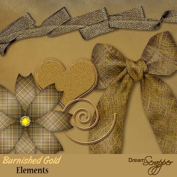
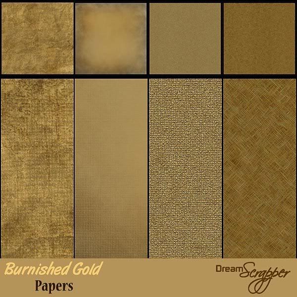
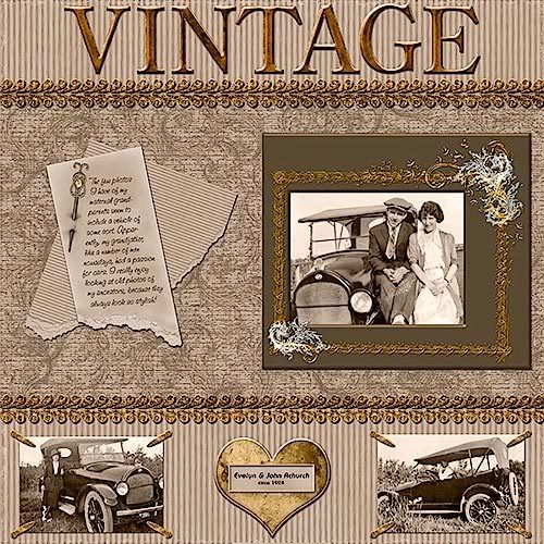
One of my favorite ways to add some texture is to add torn edges. These can be used on a photo matte or on other papers that form the background of your layout. For Photoshop users I definitely recommend the actions from Atomic Cupcake. Though you cannot buy individual actions at her site, a month's subscription will give you access to a multitude of action downloads that are well worth it! For the tearing actions, you will want to look for Torn Vellum, Torn and Inked, Medium Tear, Simple Tear, Wild Tear and Small Torn Edges. She also has a new one out called Folded Tear. Photoshop Elements users . . . though she does offer some actions that will work in your program, the tear ones are not available.
If you can't use actions, you may want to use paper templates to achieve the effect. Scrap Girls has one that you may want to try. They also have a very good tutorial for using the templates. There are also a number or tutorials on the web for creating torn edges (and here) and torn paper.
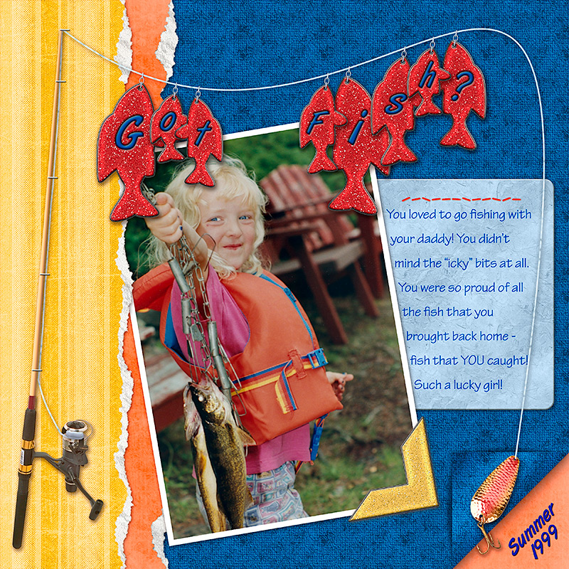 Click image for larger view and full credits
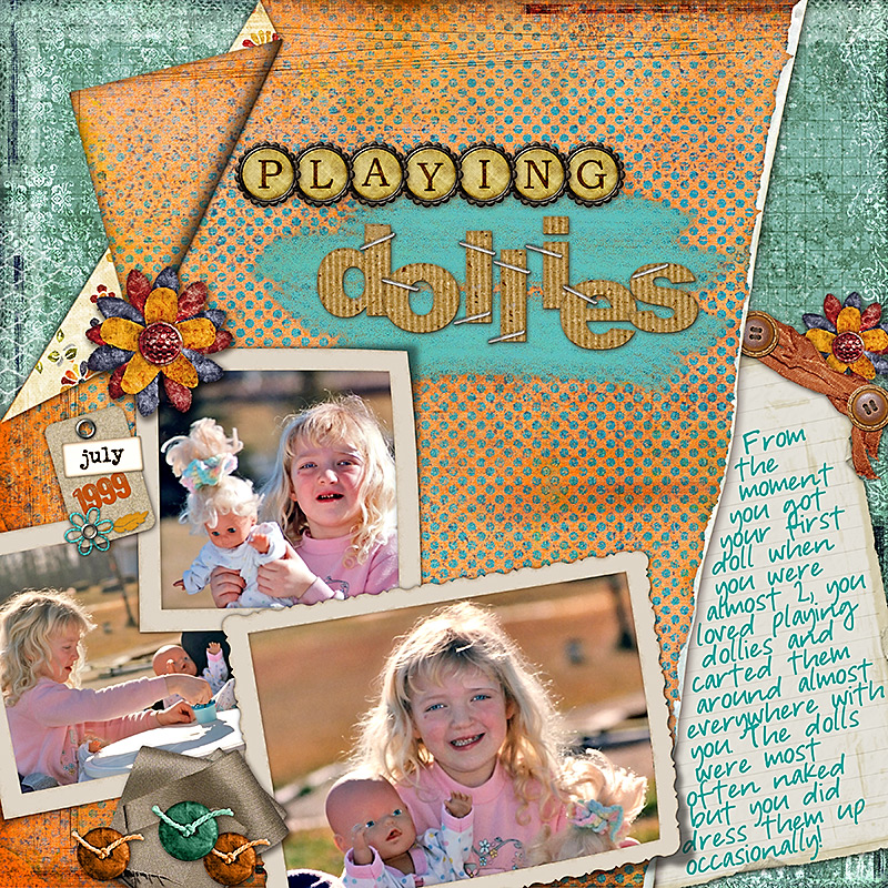 Click image for larger view and full credits
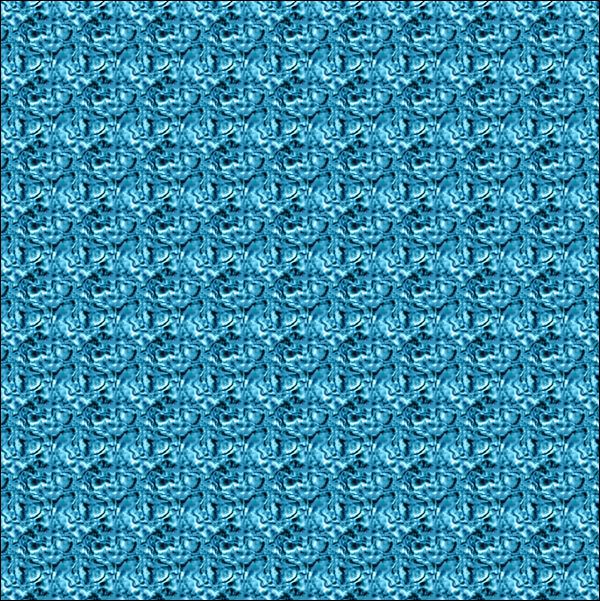
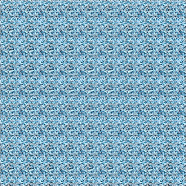
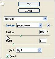
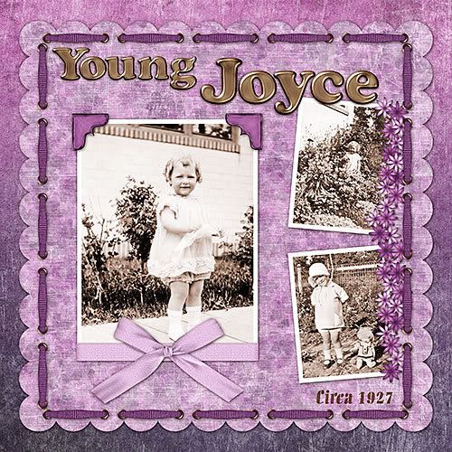
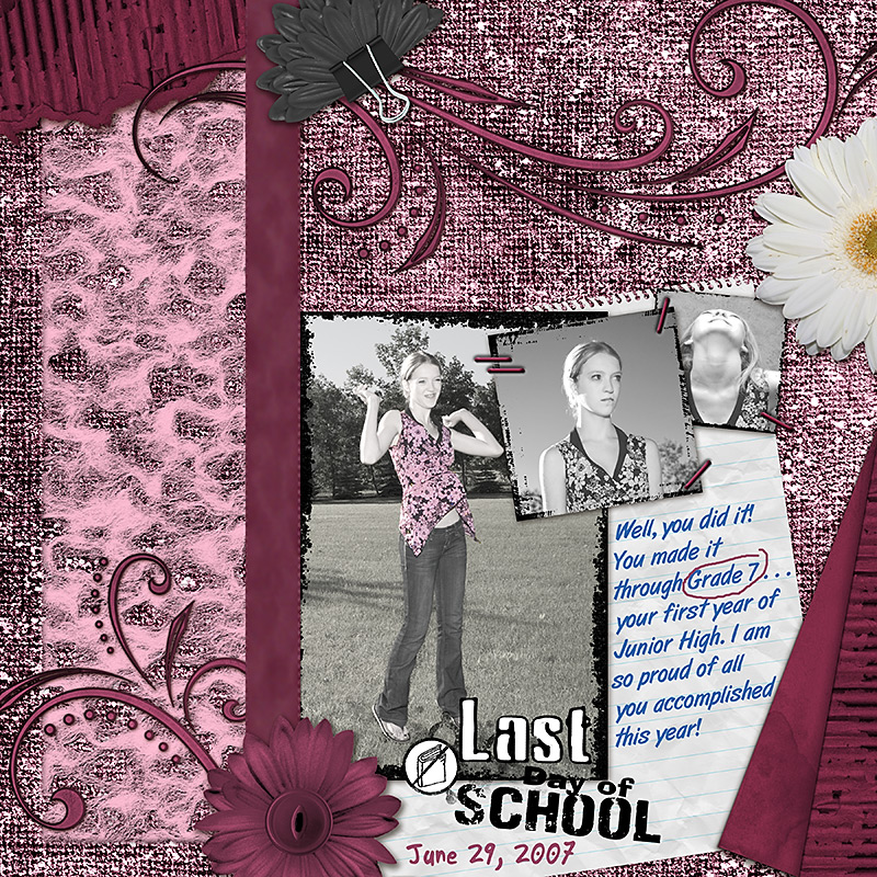
Texture can also be added by stamping (using brushes), chalking, painting, sanding and inking. I recommend the Digital Distressing Kit by Nancy Rowe Janitz which gives you not only brushes but .png files to create your own brushes for sanding, chalking, distressing, stamping, painting and inking. The kit also includes overlays in each of the styles. As well, you get a nice tutorial in .pdf format explaining how to use each of the tools.
 Click image for larger view and full credits
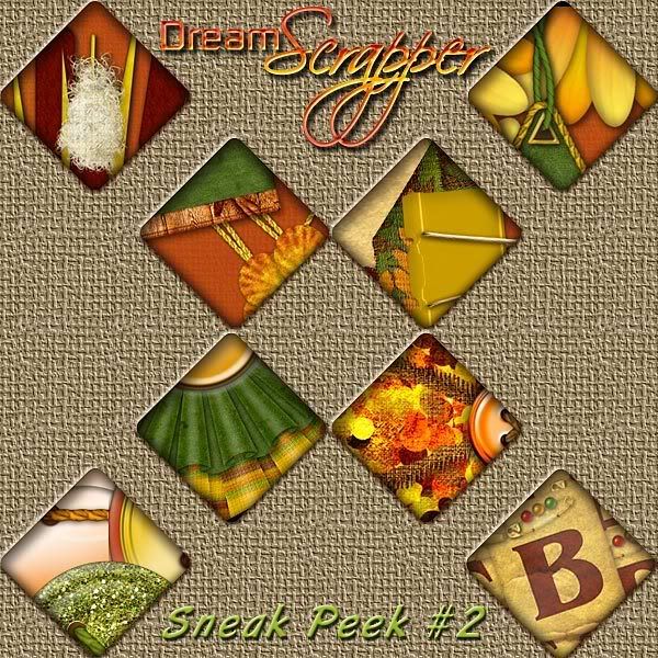
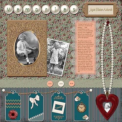
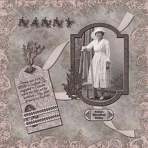
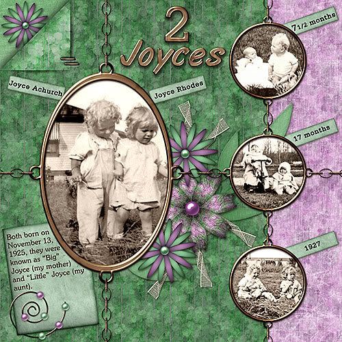
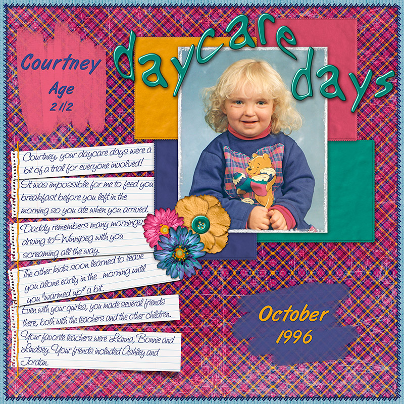
Stitching is also a favorite technique to add some texture to layouts. You can purchase both stitching brushes and stitching as .png files. For some very realistic stitching, I recommend either Gina Miller or Ztampf! Stitching is very versatile and can be used as a border, to anchor items, as embroidery and as actual frames.
 Click image for larger view and full credits
I hope you are still with me after all those possibilities for using texture!
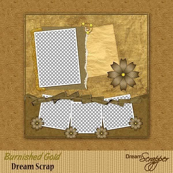
I would now like to issue a challenge to all of you. Send me a link to what you consider your BEST layout that uses texture in one of the ways discussed either here or in my earlier articles Adding Texture to Your Layouts or Using Patterns to Add Texture. I will choose my three favorite layouts and those layout creators will win this quick page:
 Click image for larger view
Good luck with your layouts! I can't wait to see what you come up with!