Sunday, March 15, 2009

In a Purple Mood

Do you like quilting or have you ever wanted to quilt? I haven’t quilted but I love the fabrics for quilting and I love exploring quilting magazines. Because of this love, I am drawn to kit designs by Mary Fran. You can find her designs at her store, Nitwit Collections. She has just put up some wonderful Easter products. (You can click on the images to be taken directly to her store.)


 Just Hatched Collection


Bunny Hops Collection


If you like these collections (or others from her store) it would be good for you to know the way she packages things at her store. Most of the time I end up buying a collection but also the extra papers she creates that coordinate with the kit . . . both patterned and solids. I find that I always like to get the solids because each kit seems to have a distinctive texture and the solids then match up with the other papers in a layout. She also creates extra elements for some collections and these are also well worth a look! I have bought only a few of her alphas, mainly because she only includes A to Z and sometimes numerals 0 to 9 but no punctuation at all which I find totally frustrating! She only has ONE sale per year, so it is a good time to stock up if you can wait for it! Another special thing I like about Mary Fran’s products is the unique way she displays her kits – doesn’t it just look like visiting the fabric department?!

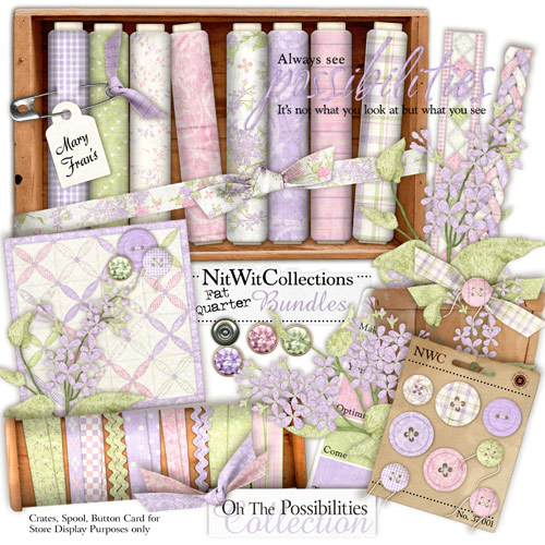
While viewing her latest kits, I stumbled on one that I had missed:


Oh The Possibilities Collection


I knew that this kit would be perfect for a remake of a paper layout I had created in the past. I had to scan the pictures because they were taken with my old SLR camera. I liked the way it turned out. What do you think? (Layout is clickable to view a detailed view with complete credits.)


Possiblities


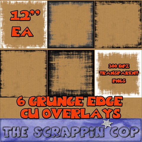
Before I go, here’s a heads up on the latest FREEBIE by The Scrappin Cop. This girl creates high quality, commercial use products and then gives them away! Don’t let the commercial use label confuse you . . . you can certainly use them for personal use but if you ever decide to design your own products, these can be used. Just be sure to follow her terms. Anyway, she has some neat Grungy Edge Overlays that are fabulous for changing the look of papers you already own. Just place them in a layer above your paper and then play with blend modes or change their color.


The Scrappin Cop


If you have never been to her blog before, be sure to check out her past downloads because they are still available. She has some really cute Easter layered templates as well.

Tuesday, March 10, 2009

Back in the Scrapping Groove

Had a great time this weekend . . . I attended a crop in Steinbach. From 4:00 to 11:00 pm on Friday and from 9:00 am to 9:00 pm on Saturday I got to scrap to my heart’s content! My friend, Charlene, accompanied me. Of course, I lugged along my laptop, EHD, and flat panel monitor. That was nothing compared with the pounds of paper and embellishments and stamps, etc. that Charlene brought!

This time round, I set a personal record of scrapping 5 pages! Though I still consider myself a “journey” scrapbooker i.e.. I take my time and design my pages just the way I want them with no actual time limit or deadline in place, I was still quite pleased with how much I accomplished. What do you think? (All images are clickable to a larger, more detailed version.)


Kindergarten


Bubble Girl


On The Right Note


Great To Be Eight!

Saturday, September 27, 2008

DreamScrapper.com is Closing!

Well, it has been some time since I have posted here! I have been doing some soul searching and have made the decision to hang up my designing hat and move on to other things! I greatly appreciate the support of all my customers over this past year! It is you who have made designing such a pleasure!

I will definitely be staying in the scrapping community and will even post on this blog (hopefully not so long between posts, this time!) as often as I can.


Monday, July 21, 2008

Playing with Summer Delight

Today I enjoyed working with my new kit, Summer Delight, to create the following layout:
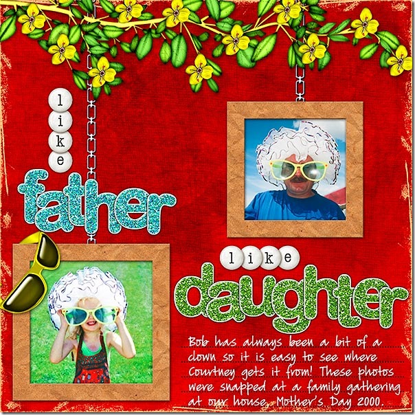
Like Father Like Daughter
Click layout for detailed view and full credits.

At first, I played with the placement of the photos and the sizing of them. At first I considered making one photo quite a bit larger than the other but the photo quality wasn’t that great so I decided against that idea. I did consider doing a blended layout but decided that I wanted to focus on the photos rather than blend either one into the background. Because there were only two photos, for a balanced layout I thought of making them both exactly the same size and positioned in the centre of the page to allow for the title above and below the photos. This didn’t look too bad but then I thought about the idea of hanging each photo on a chain and decided I liked that idea best!

Next, I added a 75 pixel inside stroke to each photo, knowing that when I separated the stroke from the photo layer (only available in Photoshop), the stroke would actually be larger and would result in a good size for a frame for my photo. To do this in Photoshop Elements, I would have selected the photo layer first by Control-clicking the photo’s thumbnail on the Layers Palette and then creating a new layer above the photo on which to place the stroke. I then chose one of the inked kraft papers from the kit and clipped it to the stroke layer. I resized the paper to about 50% and added a slight bevel and a drop shadow.

I placed the branch of yellow flowers at the top of the layout so I would have somewhere in which to hide the chains for the photos. On a separate layer, I used a chain brush to stroke the chain and then applied a metal style to make the chains look realistic. To allow enough room for the title words, I played with the sizing of the photos a bit. I then added the glitter sticker alphas, overlapping the title letters slightly to get them all into the space I had for them. I chose to use the alpha, Talk Dots by Mary Fran, to create the other word in the title and to give a bit more repetition for emphasis. If you have never checked out the Nitwit Collections store, you are in for a treat! I just love how all the products are displayed. This is the preview for the alpha I used. Isn't it the cutest?
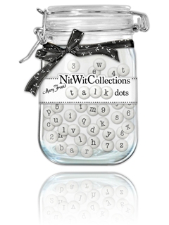
Talk Dots

Of course, since the photos are all about big sunglasses, I had to include a pair from the kit! I decided that the best placement would be to hang them over the edge of the bottom photo. I chose to use a yellow pair to form a kind of visual triangle effect on the layout => sunglasses on the bottom => sunglasses on my husband’s photo => and yellow flowers at the top of the layout. You can read about the Visual Triangle on Scraps of Mind.

I used a journaling lines brush that I had created to stamp lines on my page and then journaled on another layer.

I thought I was about finished but the layout still seemed to need something. That's when I decided to used inked edges to mess things up a bit! I tried them in each of the kit colors but what looked best was the neutral tan of the kraft paper.

The last thing to try before finishing was to boost contrast. In Photoshop, I do this with Curves. Even if things seem to look ok, just trying a small shot of contrast can really make a powerful impact on a layout!

What do you think? For those of you who have already bought Summer Delight, I would love to see what you are creating with it!

Now, to add to your pleasure . . . I have created both a Summer Delight Brag Book and some DreamScraps (otherwise known as Quick Pages)!
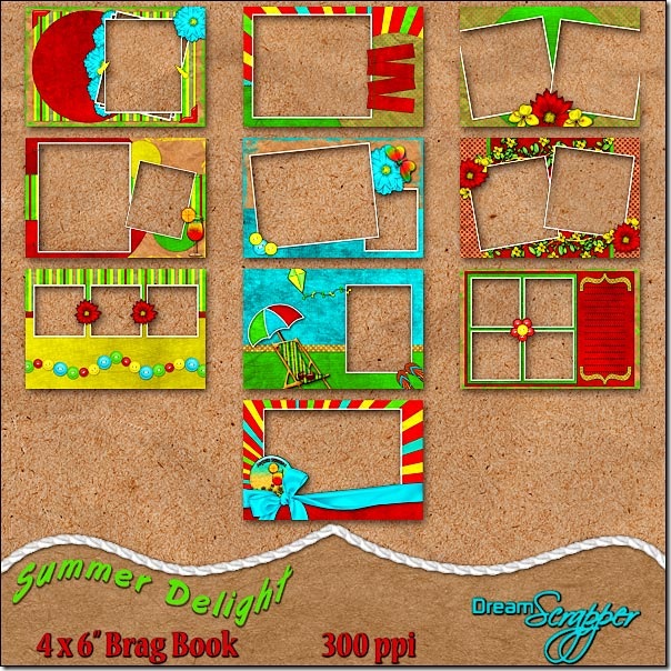
Summer Delight 4 x 6" Brag Book

The Summer Delight Brag Book, by DreamScrapper, has been designed using the funky and vibrant colors of sunshine yellow, cherry red, luscious lime and totally turquoise from the Summer Delight kit. The ten pages of this brag book will be perfect for displaying all your summer photos. Simply place your photos on a layer below the brag book page and print! All pages are created at 300ppi and saved as png files to preserve transparency. Drop shadows are applied only where layering of pieces makes shadowing necessary for realism. Special thanks to Atomic Cupcake. Thank you to Tandika Star and DigiScrapDesigner for items used in the creation of this product. For even more options for your summer photos, be sure to check out the full Summer Delight Page Kit.
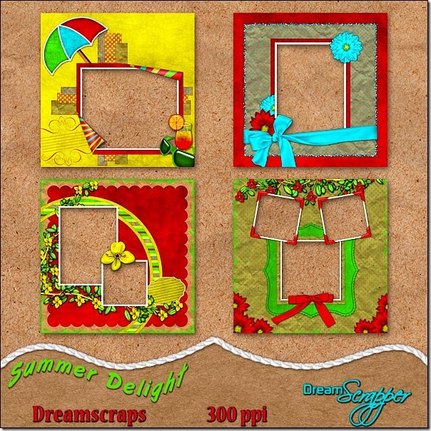
Summer Delight DreamScraps

Designed using the funky and vibrant colors of sunshine yellow, cherry red, luscious lime and totally turquoise from the Summer Delight Page Kit, by Dreamscrapper, these four quick pages will have you displaying your summer photos in no time! Simply place your photos on a layer beneath the quick page. Add titles and journaling, if desired, and print! All pages are created at 300ppi and saved as png files to preserve transparency. Drop shadows are applied only where layering of pieces makes shadowing necessary for realism. Special thanks to Atomic Cupcake. Thank you to Tandika Star and DigiScrapDesigner for items used in the creation of this product. For even more options for your summer photos, be sure to check out the full Summer Delight Page Kit.

Tuesday, July 15, 2008

Brilliante Weblog Award and Some New Layouts

Karen from Scraps of Mind has awarded me the Brilliante Weblog award. What a surprise this was! Because of this, I get to sport the logo:

brillanteweblogawardbyvcn1

Though I cannot nominate Karen for the award (since she already has it) I can certainly endorse her blog as a good one to read regularly. She often has tutorials for scrapbooking but she also raises some interesting questions from time to time regarding scrapbooking issues. Make sure you pay her a visit on her blog.

The rules of the award are:
1. The winner can put the logo on her blog.
2. Link the person you received your award from.
3. Nominate at least 7 other blogs.
4. Put links of those blogs on yours.
5. Leave a message on the blogs of the girls you’ve nominated

Unfortunately, I don’t have the time to read a lot of blogs like I used to do so I don’t have a list of 7. On top of this, Karen already picked one of the blogs I would have nominated for this award – Hummie’s World.

This leaves me to nominate only Misty Cato Designs. I have been a regular reader of Misty’s for some time now. Not only is she a great designer but she also provides several well written tutorials and freebies on her blog. She is also very good at injecting personal glimpses of her life into her blog posts . . . something that I am NOT good at doing!

======================================================

I have been enjoying doing some personal scrapping this summer, using products from some of my favorite designers.

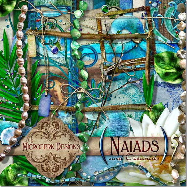
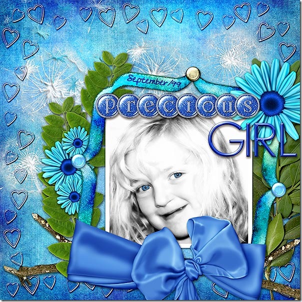
In my layout, Precious Girl, I was drawn to use of one of Miki Ferkul’s kits, Naiads ‘n’ Oceanids, because of its vibrant colors.

Naiads and Oceanids

I always enjoy reading Miki’s product descriptions because she always has a little story to go with each of her kits so it is like getting a mini history lesson to go along with your scrapping!

Precious Girl
Click layout for detailed version and full credits.

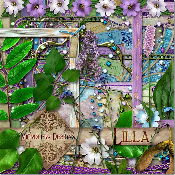
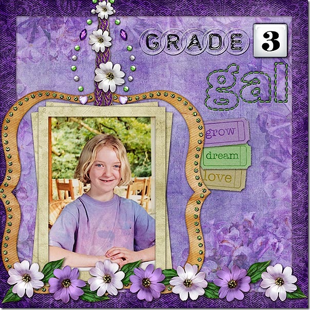
In Grade 3 Gal, I used another of Miki’s kits:

Lilla

I was drawn to the fresh, spring-like colors in this kit. I decided they would be the perfect kit to highlight my daughter’s grade 3 photo.

Grade 3 Gal
Click layout for detailed version and full credits.

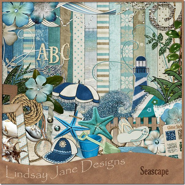
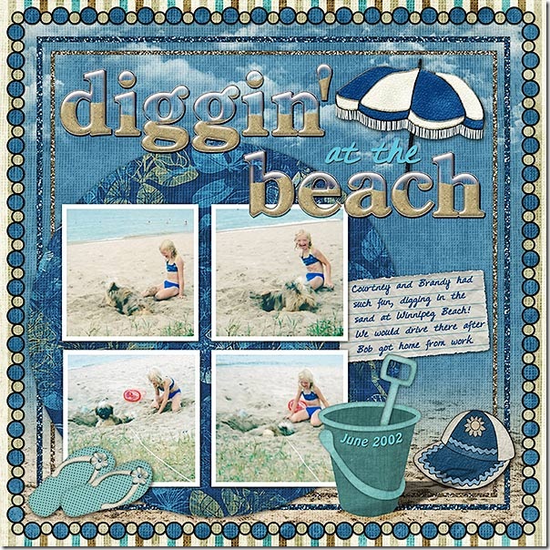
Lastly, I created the layout, Diggin’ at the Beach. I primarily used Seascape by Lindsay Jane Designs. If you need a kit to scrap beach/ocean shots, this is a fabulous kit!

Seascape

I have been wanting to scrap these shots for some time . . . both my daughter and our dog, Brandy, had a great time digging in the sand the day these were taken! I think the alpha is the crowning touch on this layout . . . it is Beachy Alpha by Monica McClain.

Diggin' at the Beach
Click layout for detailed version and full credits.

I would love to see some of the layouts that you have been creating – leave me a link below!