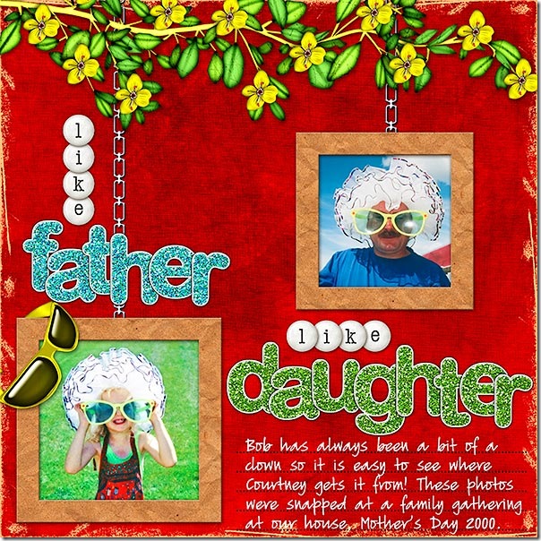
Today I enjoyed working with my new kit, Summer Delight, to create the following layout:

Click layout for detailed view and full credits.
At first, I played with the placement of the photos and the sizing of them. At first I considered making one photo quite a bit larger than the other but the photo quality wasn’t that great so I decided against that idea. I did consider doing a blended layout but decided that I wanted to focus on the photos rather than blend either one into the background. Because there were only two photos, for a balanced layout I thought of making them both exactly the same size and positioned in the centre of the page to allow for the title above and below the photos. This didn’t look too bad but then I thought about the idea of hanging each photo on a chain and decided I liked that idea best!
Next, I added a 75 pixel inside stroke to each photo, knowing that when I separated the stroke from the photo layer (only available in Photoshop), the stroke would actually be larger and would result in a good size for a frame for my photo. To do this in Photoshop Elements, I would have selected the photo layer first by Control-clicking the photo’s thumbnail on the Layers Palette and then creating a new layer above the photo on which to place the stroke. I then chose one of the inked kraft papers from the kit and clipped it to the stroke layer. I resized the paper to about 50% and added a slight bevel and a drop shadow.
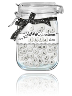
I placed the branch of yellow flowers at the top of the layout so I would have somewhere in which to hide the chains for the photos. On a separate layer, I used a chain brush to stroke the chain and then applied a metal style to make the chains look realistic. To allow enough room for the title words, I played with the sizing of the photos a bit. I then added the glitter sticker alphas, overlapping the title letters slightly to get them all into the space I had for them. I chose to use the alpha, Talk Dots by Mary Fran, to create the other word in the title and to give a bit more repetition for emphasis. If you have never checked out the Nitwit Collections store, you are in for a treat! I just love how all the products are displayed. This is the preview for the alpha I used. Isn't it the cutest?
Of course, since the photos are all about big sunglasses, I had to include a pair from the kit! I decided that the best placement would be to hang them over the edge of the bottom photo. I chose to use a yellow pair to form a kind of visual triangle effect on the layout => sunglasses on the bottom => sunglasses on my husband’s photo => and yellow flowers at the top of the layout. You can read about the Visual Triangle on Scraps of Mind.
I used a journaling lines brush that I had created to stamp lines on my page and then journaled on another layer.
I thought I was about finished but the layout still seemed to need something. That's when I decided to used inked edges to mess things up a bit! I tried them in each of the kit colors but what looked best was the neutral tan of the kraft paper.
The last thing to try before finishing was to boost contrast. In Photoshop, I do this with Curves. Even if things seem to look ok, just trying a small shot of contrast can really make a powerful impact on a layout!
What do you think? For those of you who have already bought Summer Delight, I would love to see what you are creating with it!
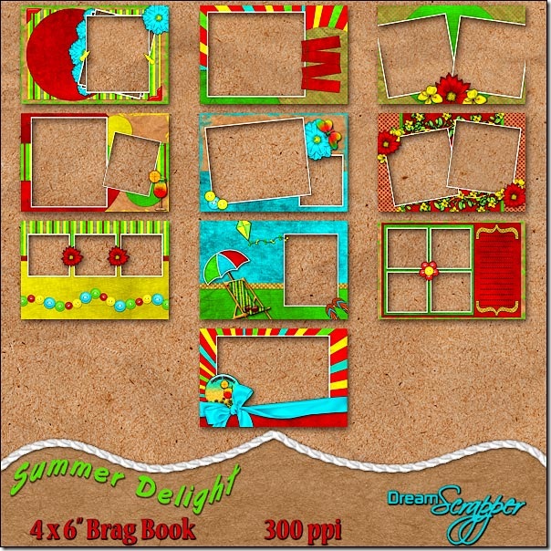
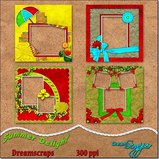
Now, to add to your pleasure . . . I have created both a Summer Delight Brag Book and some DreamScraps (otherwise known as Quick Pages)!
The Summer Delight Brag Book, by DreamScrapper, has been designed using the funky and vibrant colors of sunshine yellow, cherry red, luscious lime and totally turquoise from the Summer Delight kit. The ten pages of this brag book will be perfect for displaying all your summer photos. Simply place your photos on a layer below the brag book page and print! All pages are created at 300ppi and saved as png files to preserve transparency. Drop shadows are applied only where layering of pieces makes shadowing necessary for realism. Special thanks to Atomic Cupcake. Thank you to Tandika Star and DigiScrapDesigner for items used in the creation of this product. For even more options for your summer photos, be sure to check out the full Summer Delight Page Kit.
Designed using the funky and vibrant colors of sunshine yellow, cherry red, luscious lime and totally turquoise from the Summer Delight Page Kit, by Dreamscrapper, these four quick pages will have you displaying your summer photos in no time! Simply place your photos on a layer beneath the quick page. Add titles and journaling, if desired, and print! All pages are created at 300ppi and saved as png files to preserve transparency. Drop shadows are applied only where layering of pieces makes shadowing necessary for realism. Special thanks to Atomic Cupcake. Thank you to Tandika Star and DigiScrapDesigner for items used in the creation of this product. For even more options for your summer photos, be sure to check out the full Summer Delight Page Kit.


2 comments:
THis is a great Summer Holiday feeling kit Linda. And I love how you've explained your techniques to create the layout.
Thank you for linking back to my Visual Triangle article.
Lovely kit =]
I tagged u hon cuz I recently discovered ur cool blog. Stop by and see mine!
Post a Comment