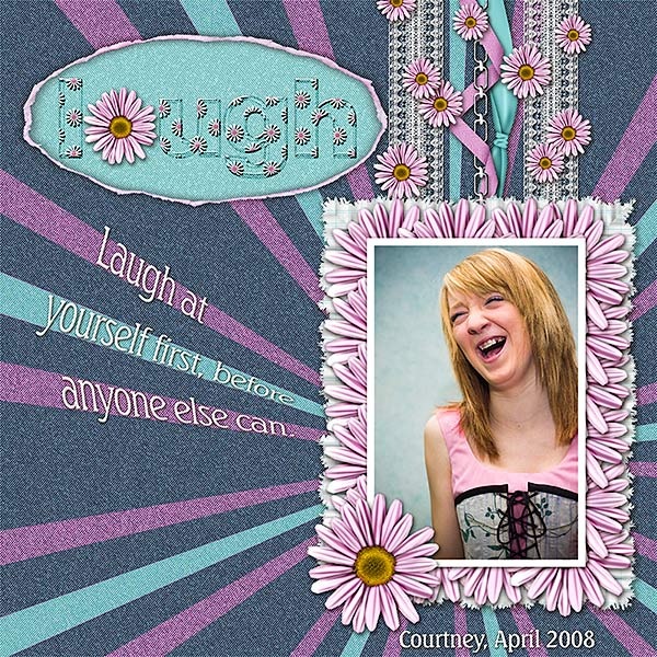
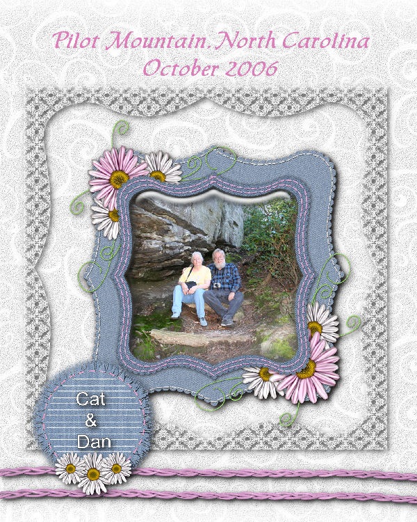
I promised to show you the acrylic scrapbook page I made while attending the crop in Steinbach. Last night, I was trying to get a picture of the thing hanging on the wall but all I got were reflections! This morning, I tried again, this time laying the page on a purple pillow near a window. I placed the layout on the pillow to supply some color for the background but the real color it should be on is teal because that's the color of our walls.
Of course, by taking the picture of this layout the way I did, you can't SEE that the thing is made of acrylic!
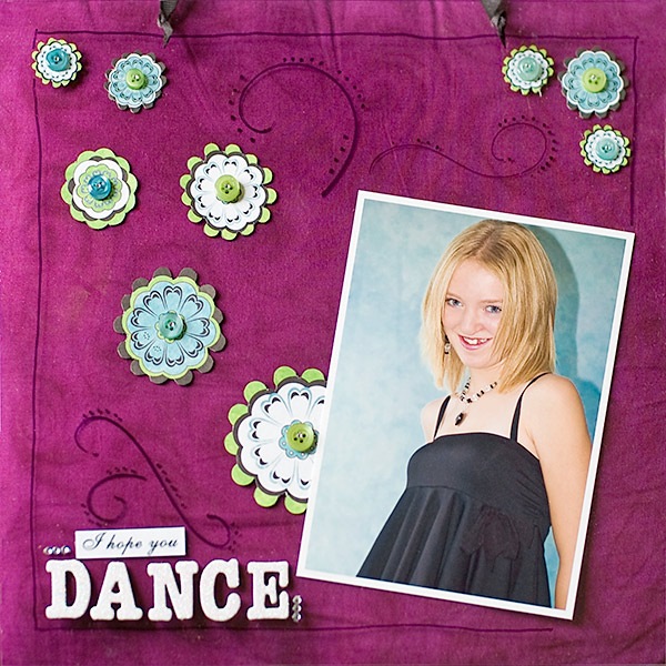
Anyway, the acrylic piece came cut in the 12 x 12 inch size and it had a peel off sheet of plastic on either side so that you could work on the layout without scratching or marking the other side. To help me with my design, I drew a little sketch. I knew that I wanted to position the photo where it was and I wanted also to have a border drawn around the layout to the bounds of the photo.
I glued on the photo, leaving a small opening where I wanted one of the flowers to tuck underneath. The border was drawn freehand. The flowers were hand cut from a flowered paper. Talk about FRUSTRATION! It is so much easier to "cut" shapes in digital scrapbooking!
Once all my flowers were cut, I laid them out on the page till I found a design I liked. They were then glued in place. Each flower was topped with a button and then a small "jewel." Next, I added the flourishes by using a swirl template. I placed the letters for DANCE and added the three little "jewels" beside the word. When I got back home, I used the computer to print out the words, "I hope you" and printed them. After cutting them to size, I glued them to the page as well.
The black bits you can see at the top of the page are where I punched two holes and fastened a ribbon so I could hang it on the wall.
In all, I am pleased with what I created though it would have been SO much easier to create this on the computer! For those of you thinking that my daughter is into dance, the quote actually comes from the song by Lee Ann Womack, and refers to the act of living life to the fullest.
I Hope You Dance
I hope you never lose your sense of wonder,
You get your fill to eat but always keep that hunger,
May you never take one single breath for granted,
God forbid love ever leave you empty handed,
I hope you still feel small when you stand beside the ocean,
Whenever one door closes I hope one more opens,
Promise me that you'll give faith a fighting chance,
And when you get the choice to sit it out or dance.
I hope you dance....I hope you dance.
I hope you never fear those mountains in the distance,
Never settle for the path of least resistance
Livin' might mean takin' chances but they're worth takin',
Lovin' might be a mistake but it's worth makin',
Don't let some hell bent heart leave you bitter,
When you come close to sellin' out reconsider,
Give the heavens above more than just a passing glance,
And when you get the choice to sit it out or dance.
I hope you dance....I hope you dance.
I hope you dance....I hope you dance.
Time is a wheel in constant motion always rolling us along,
Tell me who wants to look back on their years and wonder
Where those years have gone.
I hope you still feel small when you stand beside the ocean,
Whenever one door closes I hope one more opens,
Promise me that you'll give faith a fighting chance,
And when you get the choice to sit it out or dance.
Dance....I hope you dance.
I hope you dance....I hope you dance.
I hope you dance....I hope you dance..
Time is a wheel in constant motion always rolling us along
Tell me who wants to look back on their years and wonder where those years have gone
For those of you looking to create transparent pages digitally, Karen Karooch of Scraps of Mind has a unique technique for you!
In the meantime, I have stuck to digital scrapbooking. Though the month is June, we haven't had a lot of great weather yet. Between the days of rain, I was able to snap some photos of our lovely lilac. To me, nothing says, "Spring" like a bunch of lilac!
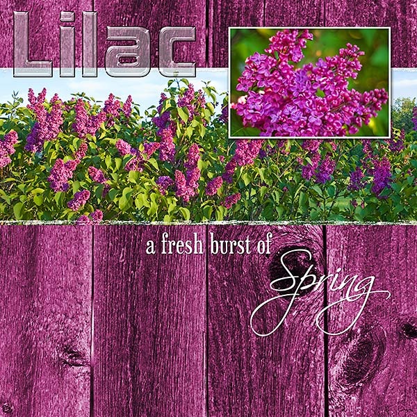
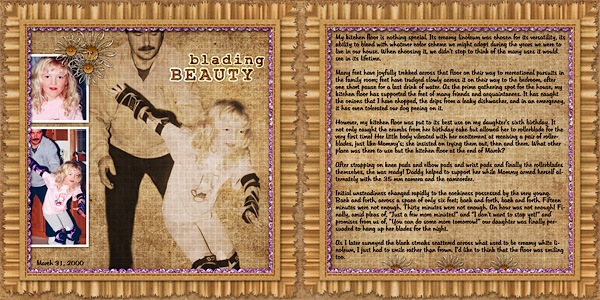
Click image for detailed view and full credits.
(And yes, our lilac REALLY is this dark purple color!)