Seldom do I create a layout where I don’t change at least one layer’s blend mode to something other than normal. In the two-page layout, Dog Days of Summer, I have used Hard Light to blend the photos of the dogs into the background paper. I have used the Color blend mode when using a Hue/Saturation adjustment layer to subtly re-color the cardboard overlays, cardboard flourishes, and alpha. When it came to creating the “summer” portion of the title, I also made use of a layer blend mode, Luminosity, to create the desired effect.

Click layout for larger version and full credits.
The original alpha is Scratched Up 2 by Micheline Martin.
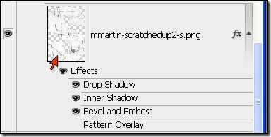
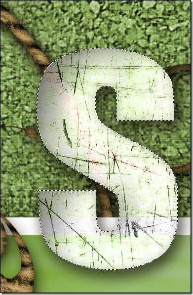
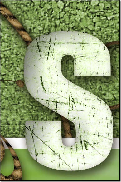
I wanted to maintain my monochromatic color scheme (yes, this is monochromatic – GREEN – except for the addition of two neutral colors – brown and white!) in the layout so I had experimented with the layer blend modes to get this green version of the alpha. However, on closer look (and you should ALWAYS do this!) I found that the Luminosity mode that I was using caused problems with the alpha because the alpha was not lying wholly on the background; instead, the alpha overlapped a photo which had a white border. What to do? To solve this problem, I ended up copying and pasting pieces of the background to put beneath each alpha layer in the layout. This way, the alpha maintained the desired effect without the problem of the blend mode being effected by overlapping the alpha on the photo. The photos below illustrate the technique I used to troubleshoot my way around the problem created by using the Luminosity blend mode.
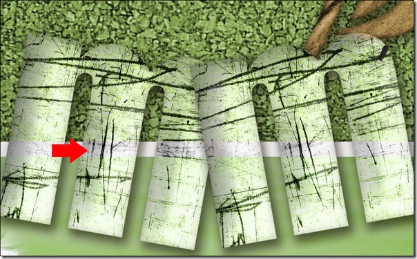
Screen cap shows problem with blend mode when alpha overlaps white border on photo.
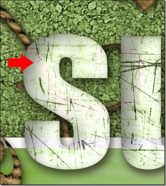
Screen cap shows problem with blend mode where alpha overlaps a cardboard flourish.
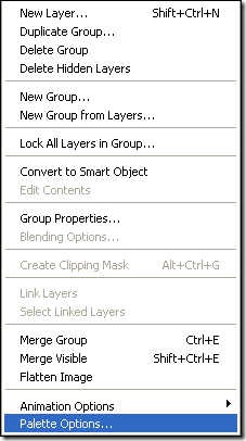
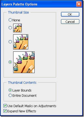
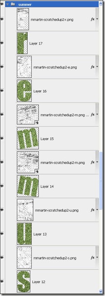
Steps to solve the problem! To more easily illustrate this tutorial, I have adjusted the Palette Options on the Layers Palette by clicking the right facing arrow at the top of the Layers Palette and choosing Palette Options from the menu.
First, select the background paper layer.
Remain on the background layer but hold Control and click on the thumbnail of the S alpha layer to select the S.
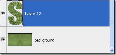
Use the shortcut Control+J to duplicate the selection to a new layer above the background layer.
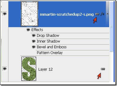
Drag the new layer up the Layers Palette until it is directly under the S alpha layer. Select both layers and link them so that they stay together.
Because the green background layer is now directly behind the letter, no other pieces of the layout show through the letter due to the choice of the Luminosity blend mode.
Repeat this procedure with all the other letters.
Now it looks much better!
I hope you have enjoyed this tutorial! This method will work for both Photoshop and Photoshop Elements though I am not certain if the shortcut Control+J still works in Photoshop Elements 6. If it doesn’t, you may use the shortcuts Control+C to copy the selection and Control+V to paste it onto a new layer.
Let me know how you have used this strategy or ask me a question about it by leaving me a comment below! Be sure to sign up for email notifications of blog posts by entering your email in the spot on the top right of my blog.





4 comments:
Great tutorial (especially listing the shortcuts, I always forget them - too many years of scrapping with a small child in one hand I think!) The photos of the dogs look wonderful, you really have an eye for a great photo!
Thanks, Kate! I have learned to use shortcuts more and more - they really speed up the process and most of them are easy to remember because they use letters of the word like Control+C for Copy. Taking pics of our dogs can be a challenge but they have so much fun running around in our yard that I couldn't resist. The little one, Bailey, really gives Brandy a workout!
I added this to the resource jamboree in my forums!
Glad you found it useful, Hummie!
Post a Comment